UI/UX Designer & Web Developer
Sherpa Insurance: Automated Onboarding Funnel
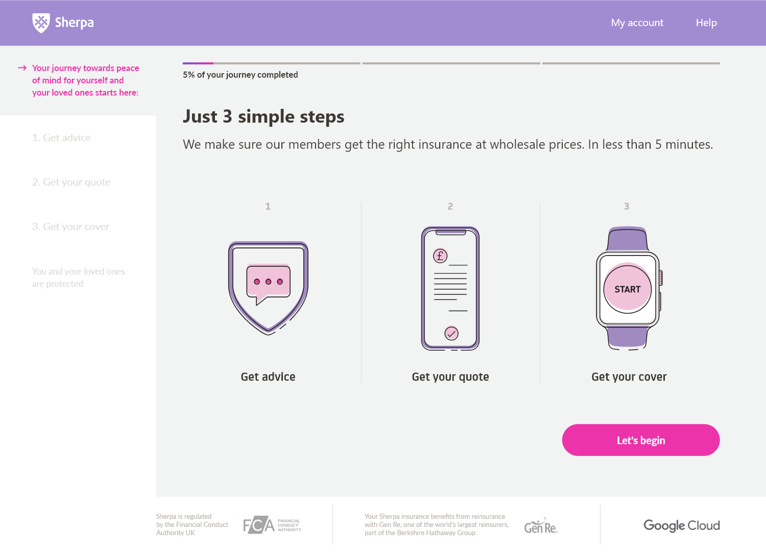
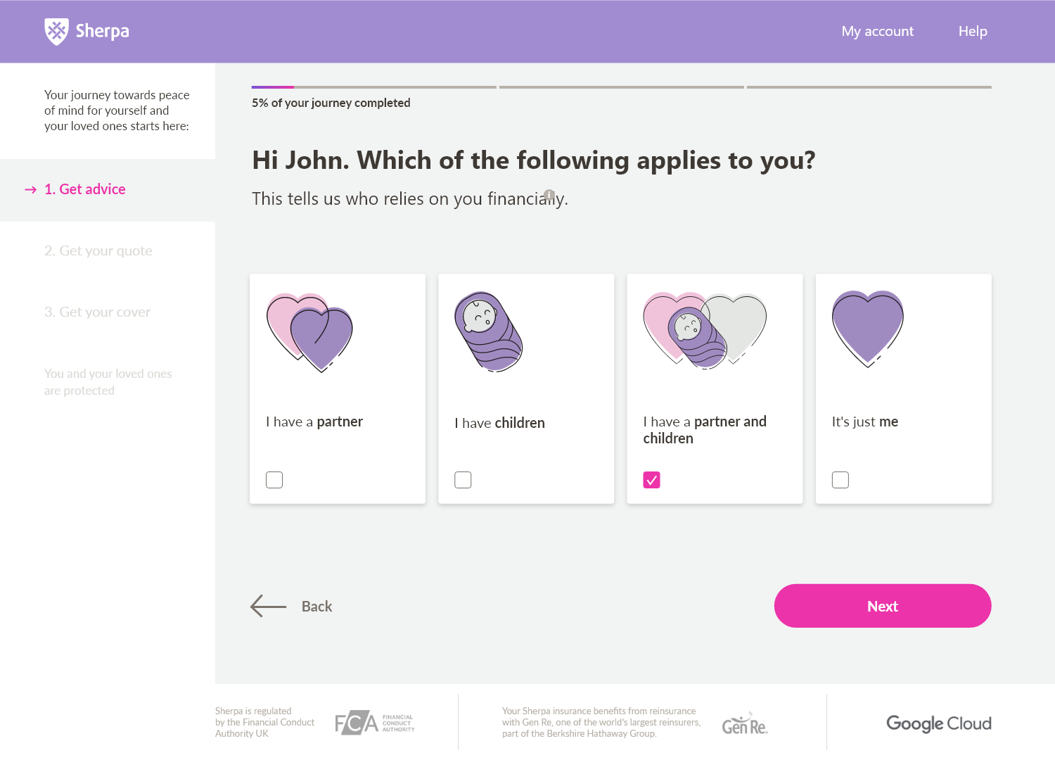
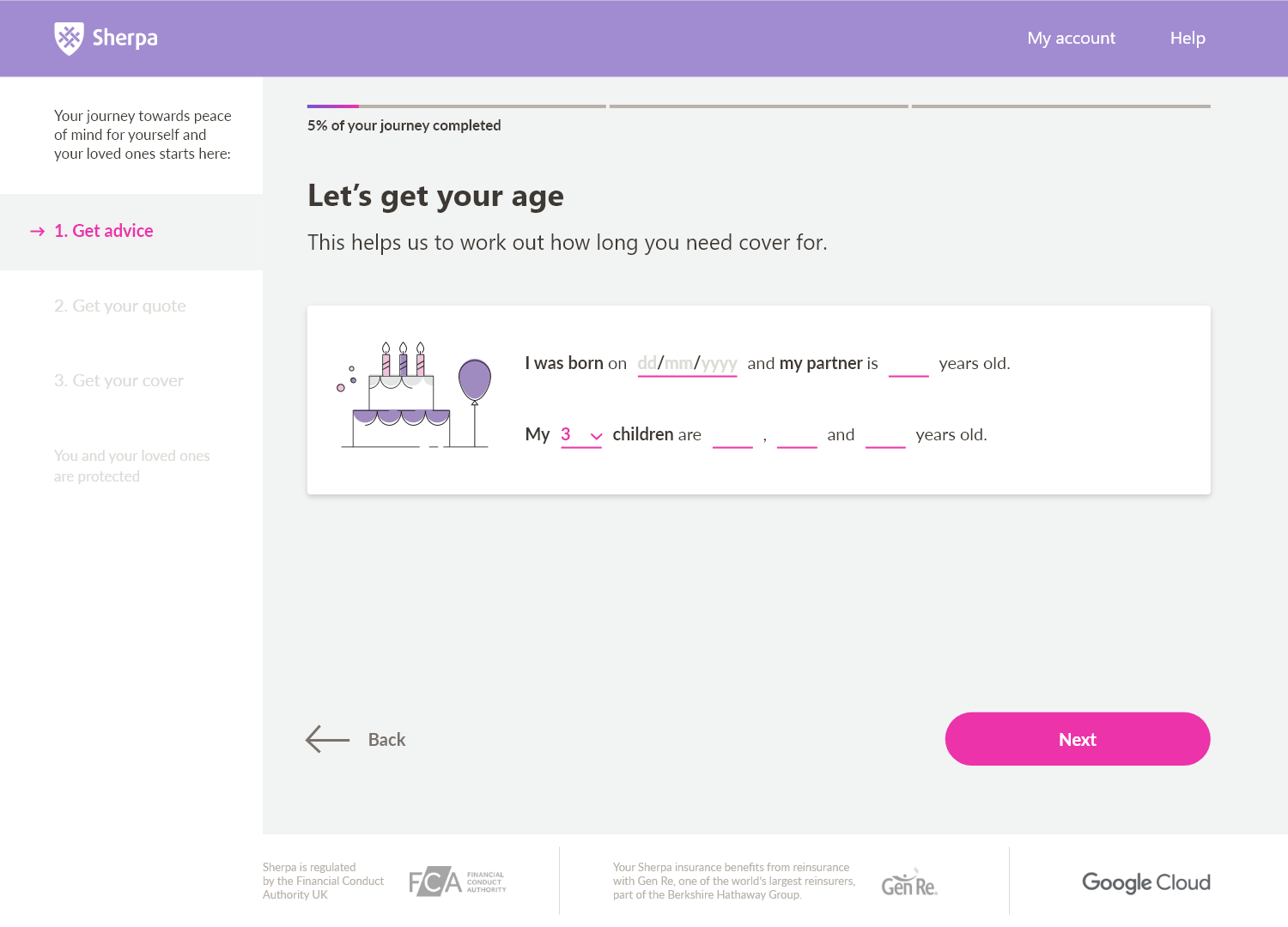
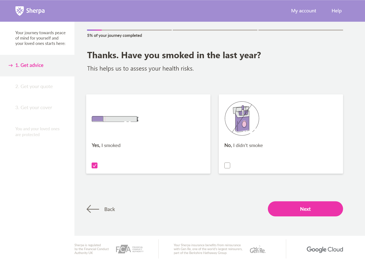
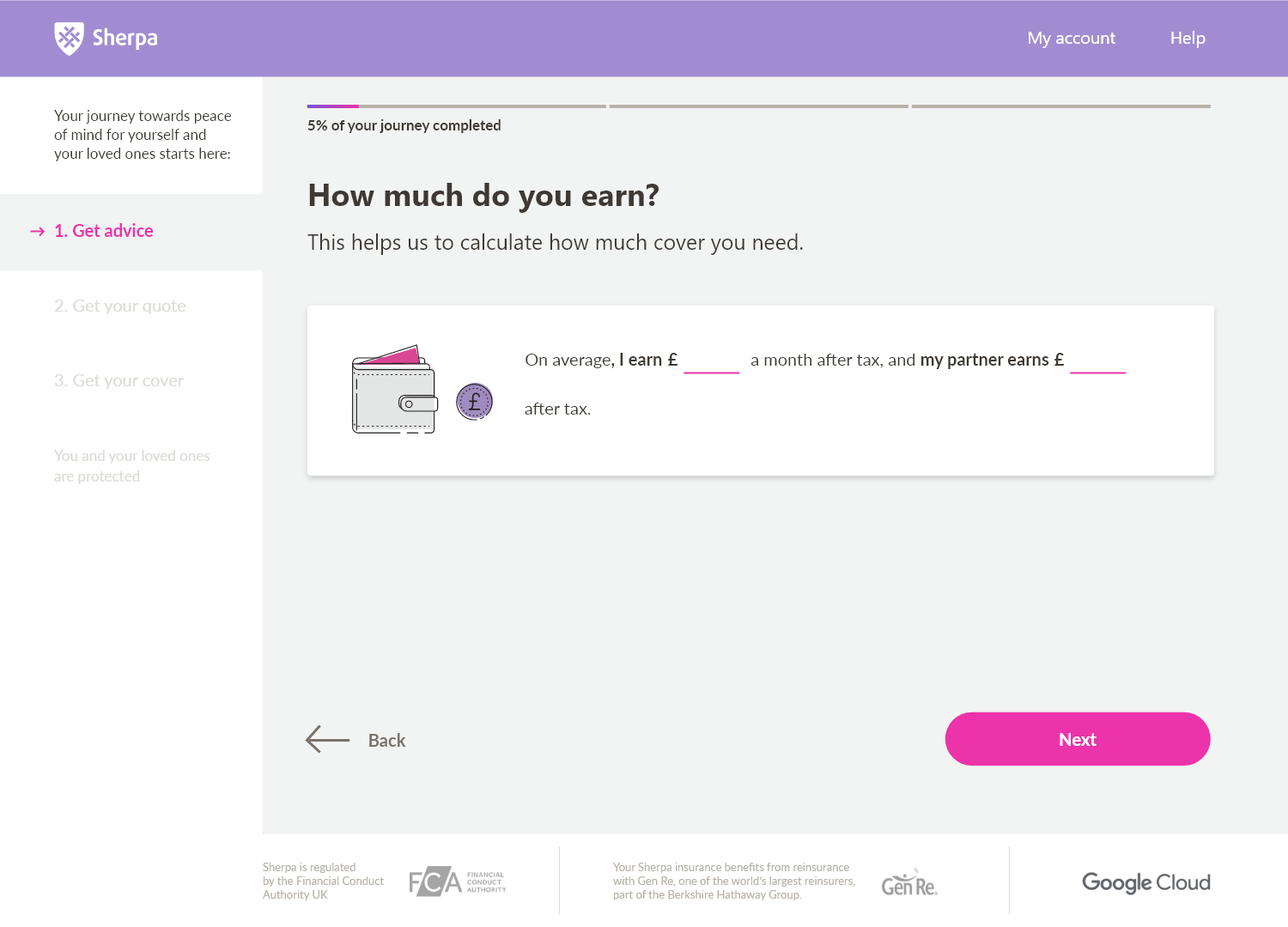
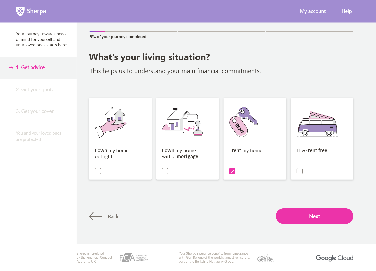
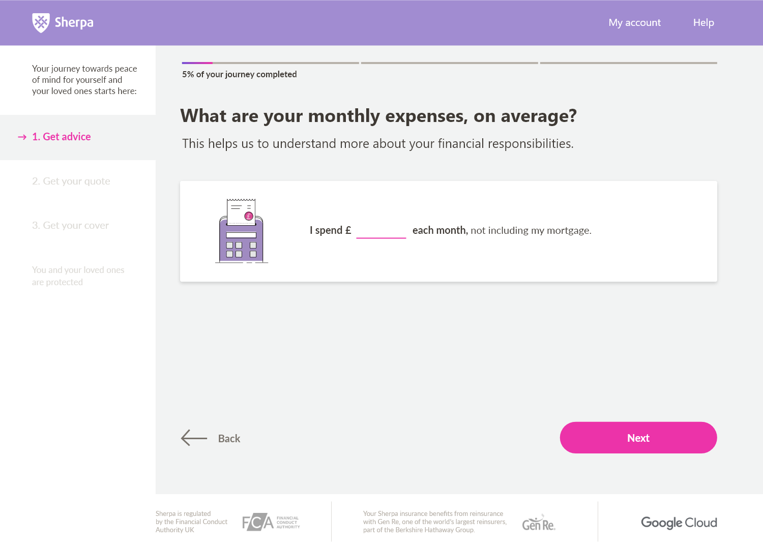
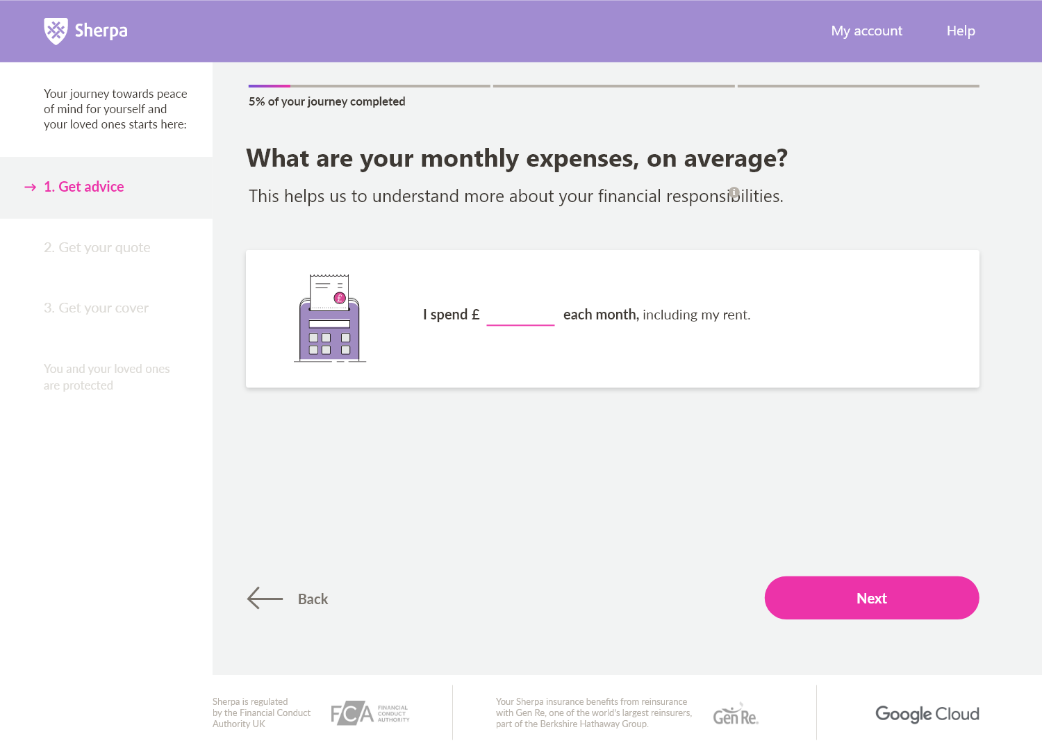
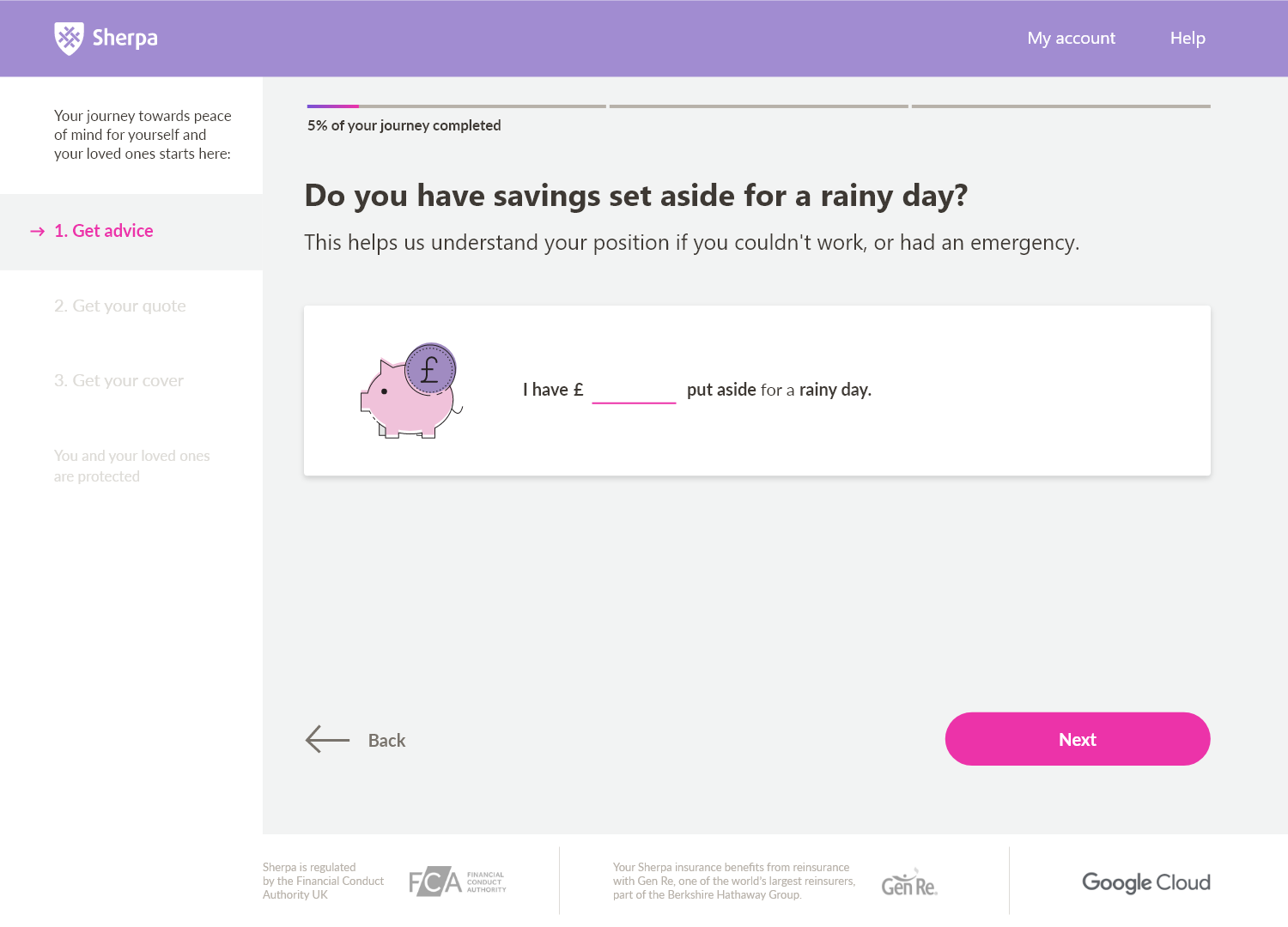
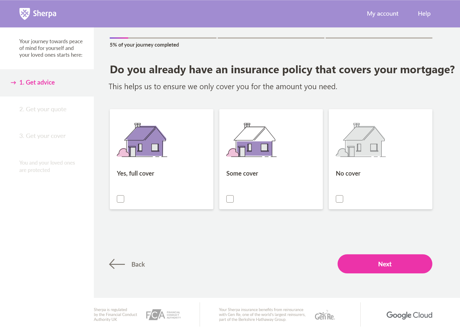
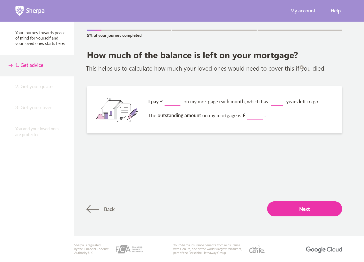
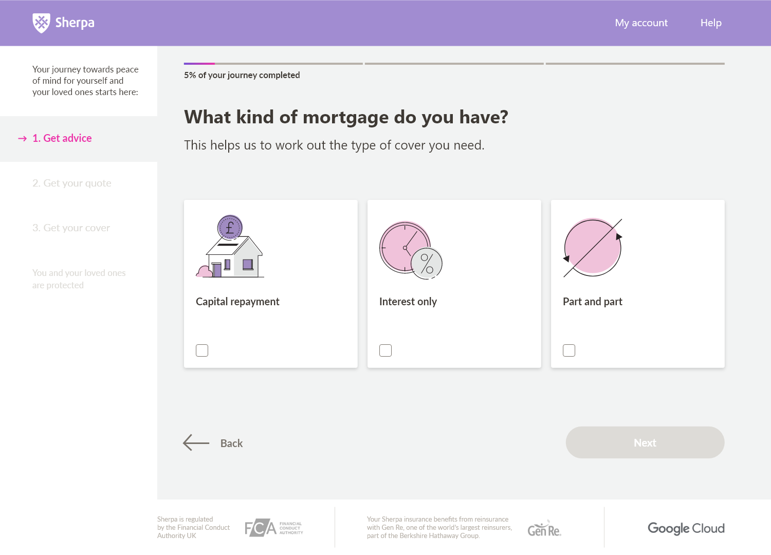
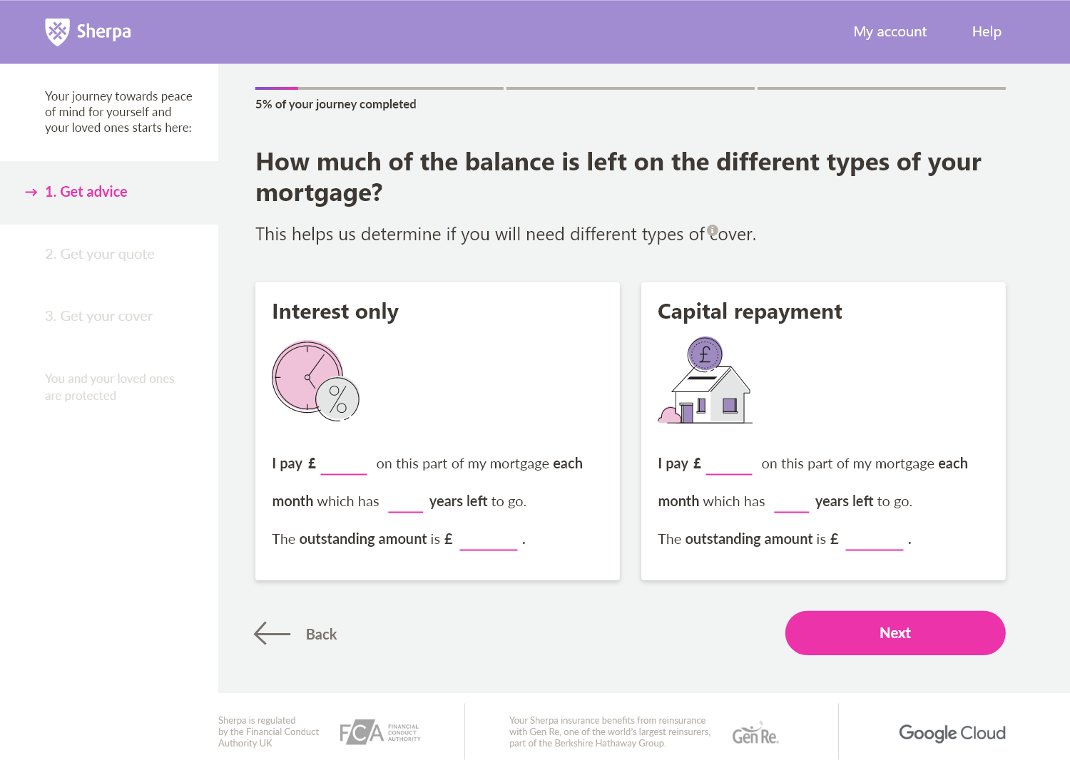
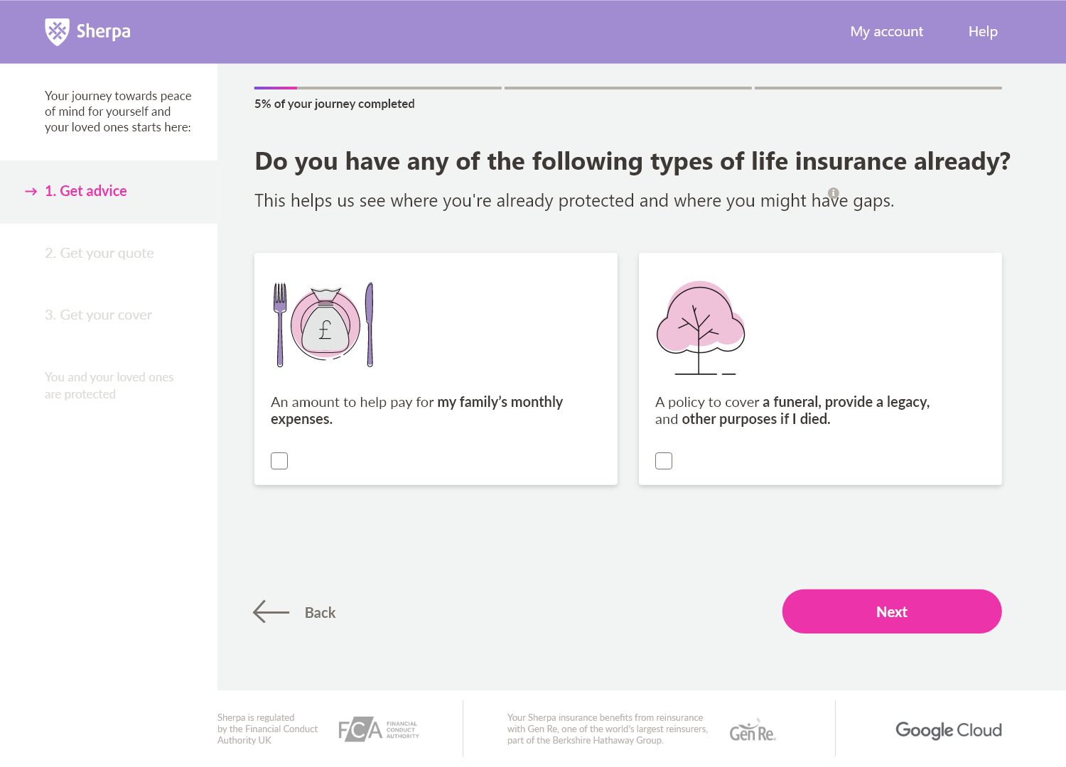
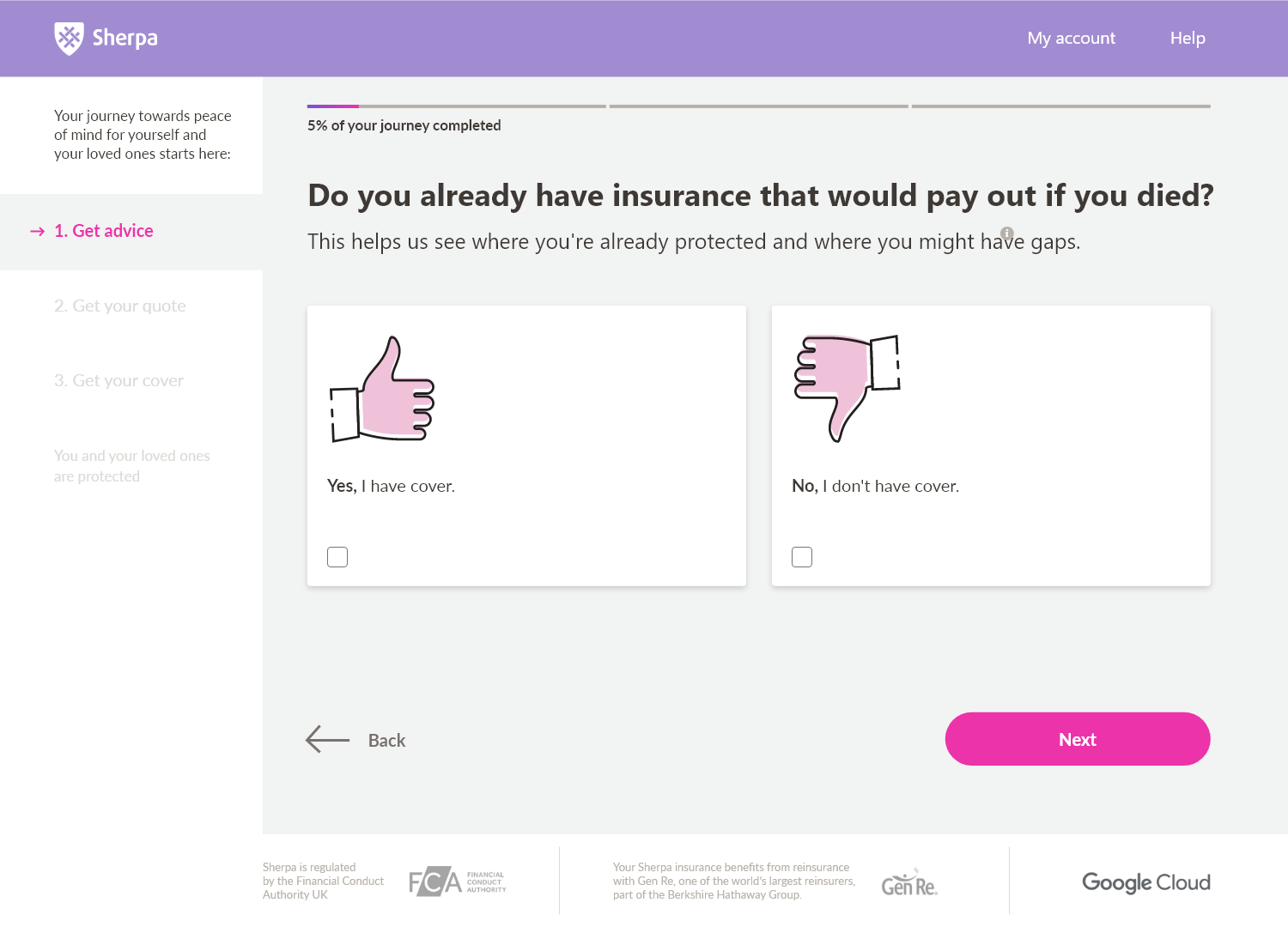
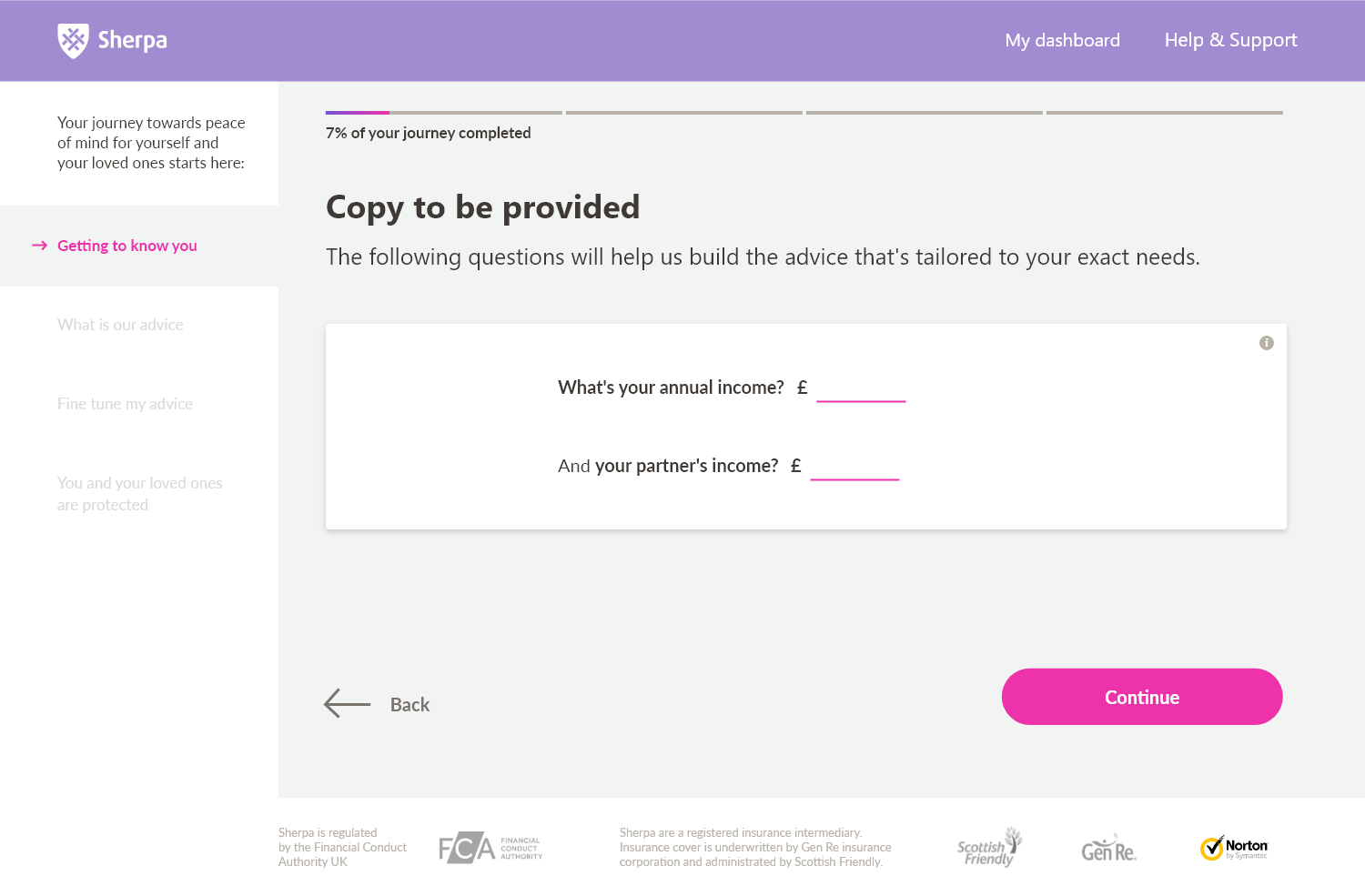
Redesigned the multi-step onboarding and quoting questionnaire into a simplified, conversational funnel. Re-architected input layouts into floating, above-the-fold card containers, significantly reducing cognitive load and drop-off rates.

UX Strategy, Bottlenecks & Design Process
Onboarding Bottlenecks
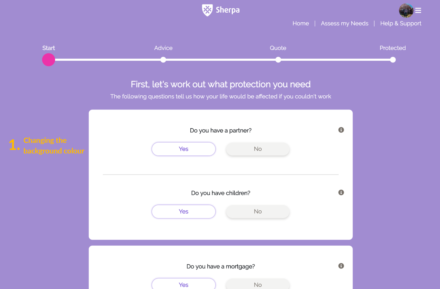
High-contrast purple background container fills distracted users, while excessively long forms created scrolling anxiety and high drop-off rates at early funnel stages.
Conversational Design
Replaced binary YES/NO questions with interactive selector tiles and grouped inputs into compact, floating cards positioned entirely above-the-fold to eliminate scroll fatigue.
Feedback & Branding
Cleaned progress indicators, integrated the warm FS Joey typeface, and built custom transition animations to mitigate underwriting API latency and reassure users during pricing calculation.
Sherpa Design System Showcase
Explore the ecosystem of the Sherpa interactive funnel. Visualize the component library, brand tokens, final mockups, and design presentations.
Brand Color Palette
Semantic and institutional colors used across the Sherpa funnel.
Royal Purple (Brand)
#4F46E5
Accent Pink
#FF007F
Success Green
#10B981
Warning Gold
#F59E0B
Alert Red
#EF4444
Dark Obsidian
#131314
Ebony Slate
#18181B
Steel Gray
#3F3F46
Typography System
Modern fonts, weights, and line heights optimized for high readability.
Compare Quotes
Your Coverage Details
Monthly Plan
Select a dynamic pricing card that fits your risk tolerance level.
Visual & Spacing Tokens
Corner rounding, shadow depth levels, and the 8px spatial grid constraints.
Visual Selector Tile (TileSelector)
Interactive tiles replacing traditional radio buttons.
Basic Cover
£9.50/mo
Premium Cover
£14.95/mo
Ultra Cover
£24.90/mo
Semantic Input Validation
Active, valid, and error states based on semantic tokens.
Loading Overlay (SpinnerOverlay)
Dynamic visual feedback during pricing API calls.
Click below to fetch dynamic dynamic policy quotes from the backend.
Funnel Stepper Progress
Step-by-step interactive flow controller.
Step 1: Your Details
Enter your age and postal area code to determine localized risk factor rates.
Step 2: Custom Coverages
Toggle additional insurance filters (e.g. breakdown support, medical coverage).
Step 3: Instanced Quotes
Review the final calculated premiums and proceed with safe checkouts.
Interactive Comparisons (Legacy vs Redesigned)
Explore two critical redesign areas using the independent slider handles.
1. Questionnaire Flow
Legacy long-form questionnaire vs. above-the-fold conversational interface.
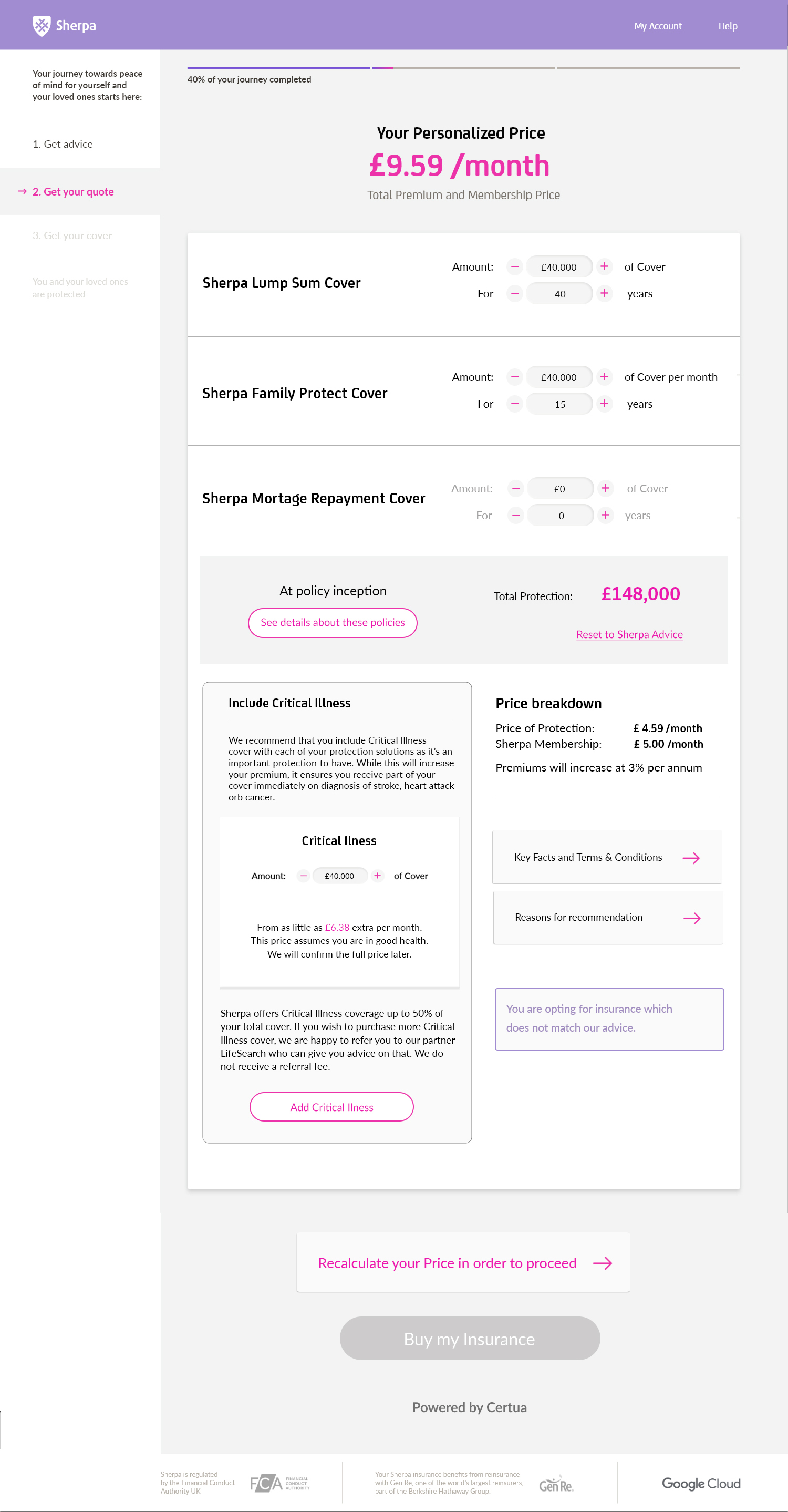
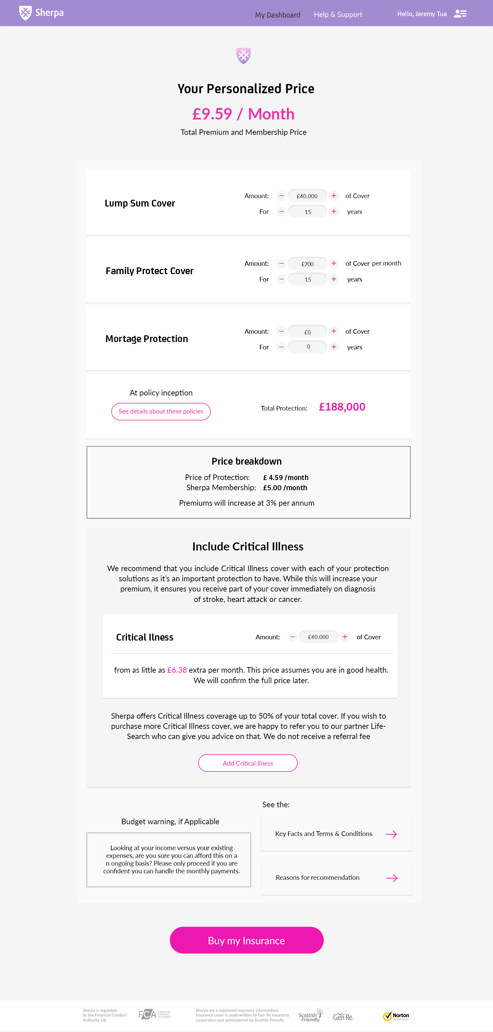
2. Quote Details Breakdown
Static legacy pricing grid vs. redesigned modular quote breakdown.
High-Fidelity Showcase Mockups
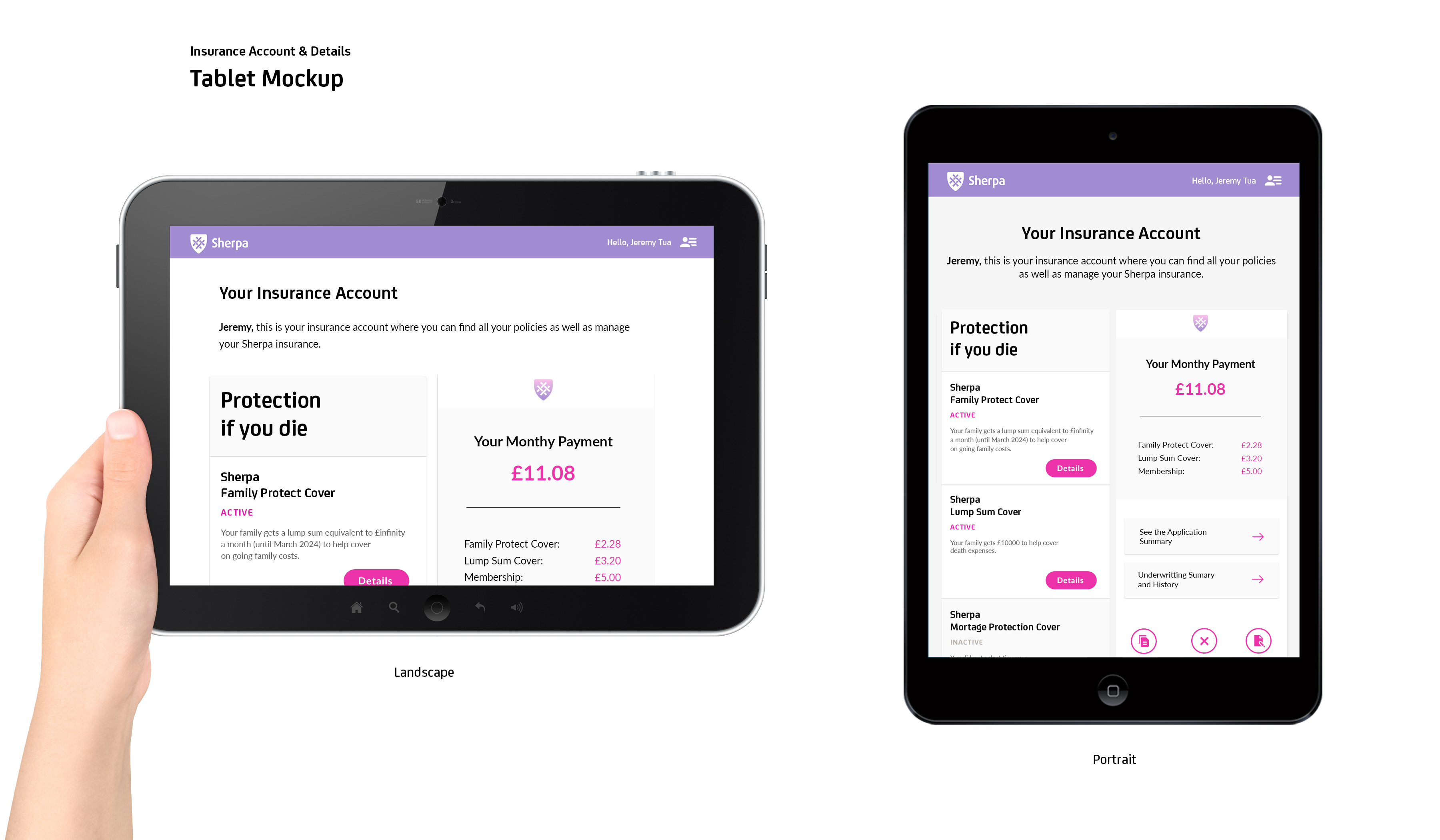
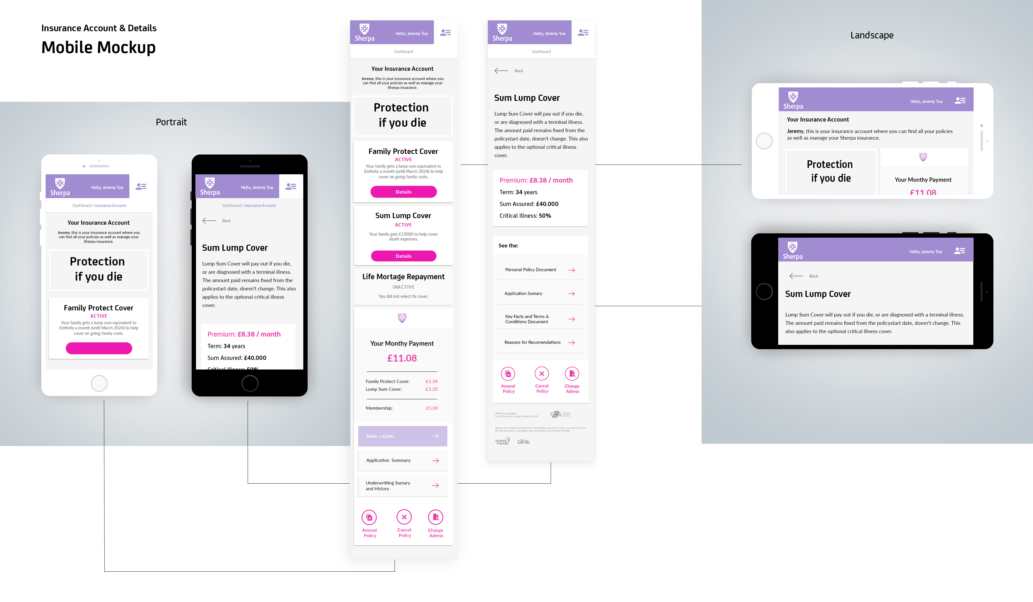
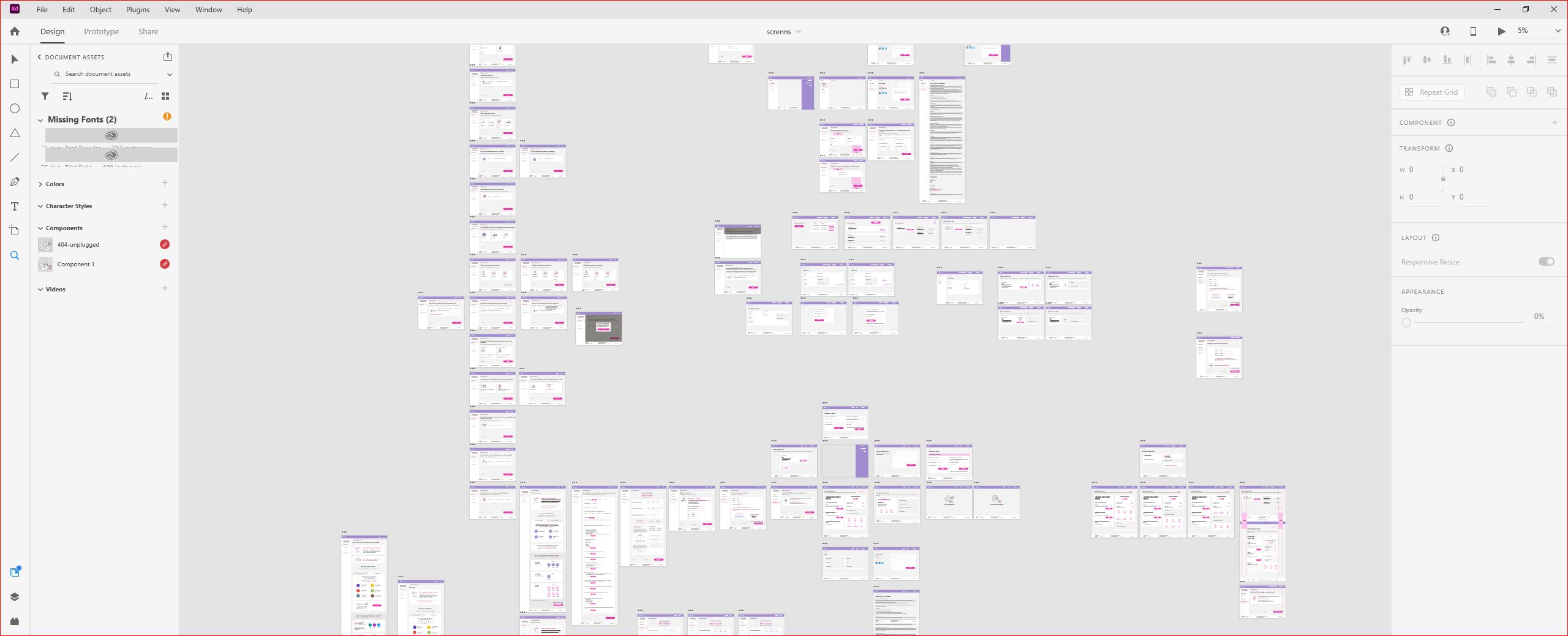
Production-ready interfaces for mobile, tablet, and design workspace viewports.